as is always the case when youre on the road painting, it took a day or two to get my painting groove on. got up to the cape yesterday late afternoon (after about 18 hrs of driving) and went out to get the "first one" out of the way. there's a period of time where you have a "rusty" feeling when you first arrive at a different locale. youve been traveling, its a different area of the country, and God help you if you did a workshop the week before like i did, painting very little that week.
went out yesterday and ive gotta say that first one was tuff! But the second painting this morning went easier, and by the "golden hour" painting in the afternoon, i was hitting my stride. this morning i purposely did some boats and water where i feel really comfortable. then this afternoon i did water and some architecture which is harder but helps me "ratchet" it up even more.
gotta tweak em and take photos but i'll get em up here as soon as some cloudy weather keeps me from being out in the field painting as hard as possible. the show i'm painting for will be around ten days from now. gotta quit reminding myself how little time there is for such a big task. like the nike ad says "just do it!"

Wednesday, June 30, 2010
Sunday, June 27, 2010
Heading off to the Cape to paint
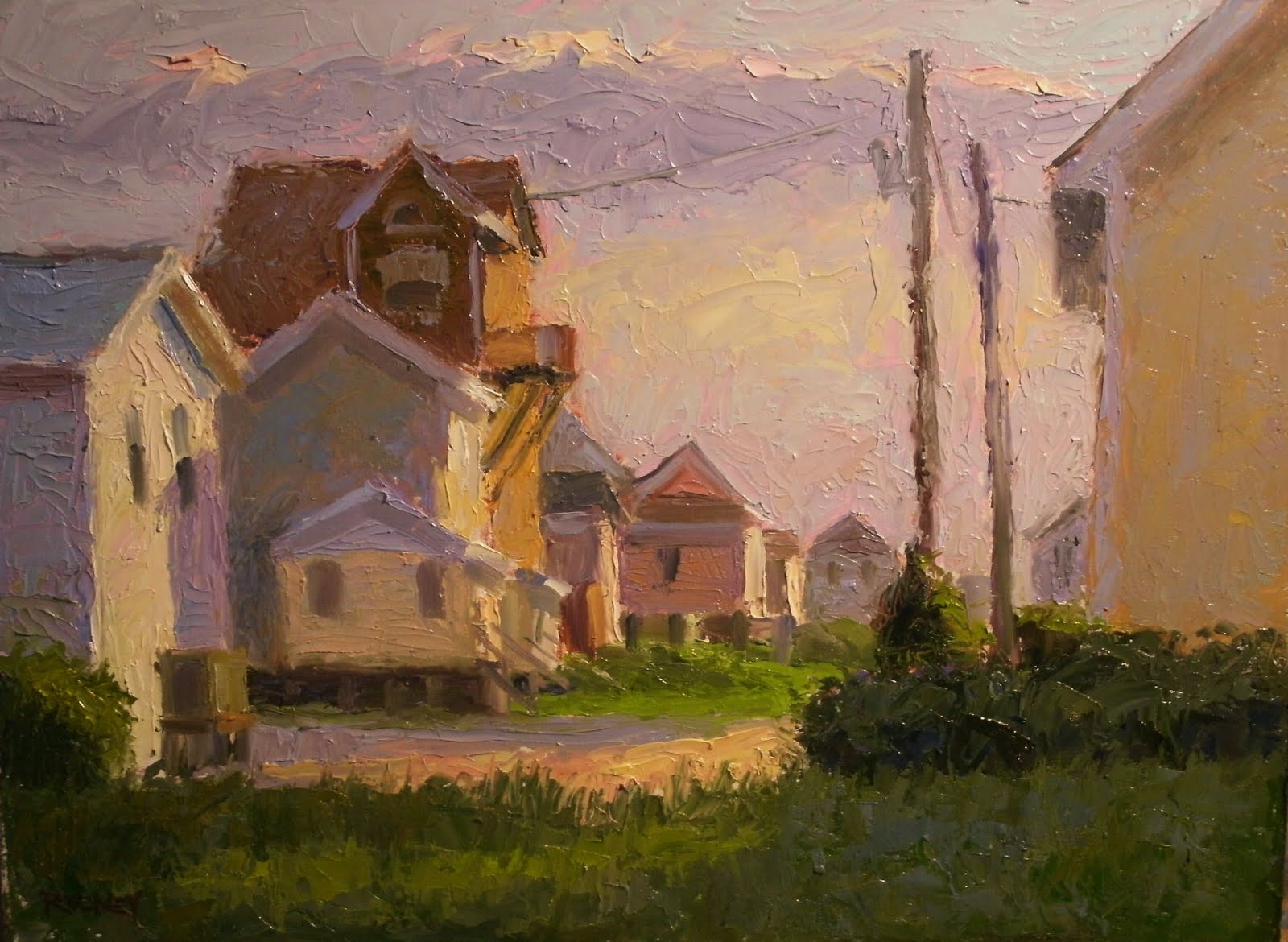
 Near the Secret Spot-9x12
if you like it contact me and i'll give you availability and price
Another piece from my Ocracoke trip. this was the coolest house in the sun and the boat in the yard was the icing on the cake. had to paint it! its soooo ocracoke
this ones totally knifed with lots of thick paint, cape school style.
Packing tonite for my two week trip to Cape Cod to paint for my solo show at Elizabeth Rowley Gallery in Orleans. will paint non-stop and all pieces in the show will be done in that two weeks. sort of a marathon paint-out and show at the end of the thing! stress? naaahhh, i love a challenge.
Wednesday, June 23, 2010
Wave of the Future
Every plein air painter in eastern north carolina knows (or has heard of) Bernie Rosage Jr. He started the OOPS painting group in jacksonville and is a great organizer and promoter of all things plein air and paint. bernie was selling on EBay before anybody around here. he understands the internet, marketing and all things techy!
He was so nice to make this video and send it to me. its so good that i want to use it as a sort of "video business card". i can see this thing being the norm as a biz card but on the internet. its like a cool little short movie. alot of you reading this who have taken one on my classes are probably in it somewhere.
its too cool! check it out!
Tuesday, June 22, 2010
Wilmington NC workshop
 is this a cool place to hold a workshop or what? Thalian Hall is one of the oldest continuously operating theaters west of the mississippi. the guy who built it also did Ford Theater where President Lincoln was shot.
 is it a broadway play about painters?
Today was day two of a three day workshop in wilmington sponsored by barabara bear jamison. i know you probably think "geez, that guy says that about every one he does" but its true. this was one of the best groups of fun loving, happy, eager to learn paint slingers ive had the pleasure to instruct. We've ate food, and hors d'oevres (did i spell that right- hey before doing these workshops i thought vienna sausages were hors d'oevres LOL) hung out, talked about painting till all hours and just generally had a ball. i made lots of new friends. i've got the best gig in the world! thanks barbara and gang!
as i always do with a brand new group i'm teaching i cover the basics of painting.... that means at least a day and half painting in several tints of a neutral dark color. Values, values values, he cried! i'm sure they were tired of it after awhile but they trusted me and didnt complain. then today we mixed colors using just cad yellow, cad red, ultra. blue and white. folks are amazed that you can mix just about any color imaginable with just those three colors and white.
if youve ever taken a class with me you know that the pace is slightly rushed so that you dont have time to overanalize (yes i know what i just typed!) pretty funny for this late at night on day two eh?
tomorrow we brave the 95 plus degrees heat to put all this into practice and paint plein air at the Arboretum.
i promise the story about where we're onstage holding class soon. until then please sit by your computer expectantly and i will be right back :)
Saturday, June 19, 2010
On the Outskirts-12x16
 If you like this one let me know and i'll give you its availability and price
Jimmy C and i both painted this plein air several weeks ago. i'm just getting around to tweaking it and getting it posted. i liked the red/green scheme and the light on this old building on the outskirts of Beaufort going towards Bettie and Sea Level. isnt that a cool shadow where the hole in the roof is?
Seaside Dwelling-9x12
 If you like this cottage email me for price and availability or contact ArtSource Gallery in Raleigh
another knifed cottage. this one from atlantic beach. i think they said the temperature was about 100 degrees. i was in the shade of a big bush and was still sweating like i was standing in a house on fire.
i have a workshop in wilmington nc starting this monday. if youre interested there's a spot or two left. let me know. you can take one, two or all three days.
Thursday, June 17, 2010
On the Edge(of the E. Coast)-9x12
+9x12.JPG) If you like this one email me for availability and price
If you like this one email me for availability and pricehaving a ball with these knifed beach cottages. the color you get is amazing when youre not sloshing around dirty thinner in your paint, and all the brilliance is mixed right out of the pile, down on the palette. you do all the mixing right up on the panel with the knife. right at the end you pull out a brush and do all the little hints of small detail you cant do with a 3 inch painting knife.
ive extended my teaching DVD special until next wednesday. i'll sell you two for $25 and $6 shipping. they'll go back up to $24.99 ea. next thursday. email me if you'd like to know what i'm teaching you in each one.
Wednesday, June 16, 2010
Waters Edge-8x6
 SOLD
SOLDtoday i was teaching a one day workshop in jacksonville nc on the cape cod underpainting technique. we spent the morning learning the concepts painting colored blocks under floodlights and then we went outside after lunch. i did a short demo painting a couple of the neighborhood houses and then the class got busy on their own "studies"
Wow did they do great! you could see the sunlight and lighting key in each of them. in just a few short hours.

Here's the troopers bearing 100 degree heat to paint plein air. thats dedication.
 just another day painting in heat that was more like august than the middle of june. but fun was had by all and everybody got the concept of underpainting in the cape cod school technique.
Want to paint in Tuscany Italy ten days this fall? Contact me and i can give you the scoop on my plein air workshop in Poppi just outside Florence. We'll cover the finer points of painting outside landscapes in one of the most beautiful places on earth. I only have a few spots left so let me know before its too late.
Saturday, June 12, 2010
Waterfront Reflections-9x12
 If you like this one contact me and i'll give you the price and its availability
one from an afternoon painting in New Bern. this is right down from union point. liked the huge trees and the reflections they made in the water.
started my memorization program to learn some conversational italian in preparation for my workshop in tuscany. figure if i learn thirty or so words a month till i leave, i'll know enough to at least speak a little when i get there. they say the more you use the new words you learn, the better you'll retain them, so i'm going to start using them when i can.
so here goes. this place is very vicino (near) bridgeton and not too lontano (far) from where i live near Topsail Island.
Thursday, June 10, 2010
The Tree Fort-8x10-SOLD
 this is my friend nick's tree fort in Summerland Key Florida where i spent most of the winter. he stretched rope about 30 feet up into the trees and then wound more rope around that in a web and put a futon cushion up there, some twinkly lights like you have on your christmas tree, and then fashioned some little tables lashed to the trees to set stuff on. the absolute best way (and what i did almost every afternoon) to see the sun setting over key west. what a view way up high like that. sorry it took so long to get it done for you nick!
Wednesday, June 9, 2010
Knifed Cottages
 4th St. Twilite- 12x16
if you like this one contact me or Fountainside Gallery in Wilmington
 Lavender Beach Front-12x16
if you like this one contact me or Fountainside Gallery in Wilmington
Been wanting to do some knifed beach cottages lately, so off i went to do some late yesterday afternoon and this morning. sprang out of bed so excited to get some early morning light before the sun got to high and the light "washed out". you know, where everything goes kinda glarey gray if you sleep too late?
my fave part of this one is the warm light reflected up under the porch on the righthand cottage. that was fun to capture! such a nice complement to the lavender walls in shade.
Tuesday, June 8, 2010
Inner Banks Beauty II
 if you like this one contact me or Tidewater Gallery in Swansboro, and we'll get it to you
Did this one from a 9x12 plein air study i did a few months ago in oriental. experimented with really big bristle brushes (flats) where i usually use synethic brights. seemed like the flat bristle brushes are great for larger paintings because theyre so springy and you can really load them up with paint, keeping the shapes loose and gooshey for "smooooshing" around.
these are technical terms and must be used at all times when referring to gooshey paint or moving gooshey paint around by smooooshing LOL
Monday, June 7, 2010
Values Values Values!
get that scrolling finger ready. i want you to bust back and forth between yesterdays post and the ones i did today. i just took the painting from the other day (it was dry) and painted over it changing up different shapes with different values, still keeping to only five (mostly equally divided)
so here we go.
 Heres a black and white photo of the reference material so you can see what the "original"looked like.
 scroll up and down from yesterdays post all thru these and see which one is the most pleasing arrangement of value shapes. this ones the worst of the bunch. i dont like it as well as the one from yesterdays post with the water darker. the t-shirt doesnt look as sun filled because i dropped the value of it to keep it darker than anything in the light (remember the rule) i think i just found out i'll have to break that rule on this one for the sake of the painting. we'll see.
 lightened the shadow and i like it much better but the fish and the tshirt shadow are the same. maybe i can break them apart somehow. also the darkest darks look spotty
 this is the one i pushed the light group tighter and pushed the darker group together causing a bigger gap between them. Tshirt shadow in too dark and again the really dark values are spotty. but i did darken the water
 this one i like all the relationships except the skin in shadow, its too dark. it makes the head look too isolated, like its not attached. this one works everwhere else so all i have to do is lighten the skin in shadow on the face and neck and voila! i see that ive GOT to keep the water darker than the shadow on the t- shirt for this to work. i loved the sunlight on it and thats why i wanted to paint it. so this proves beyond a shadow of a doubt that youve got to DESIGN the painting and dont conform to 'rules' and surely not to the photo or real subject matter IF it makes a worse painting.
an answer from the comments section: asking does it matter that i didnt make the distinction between the water being darker on the left and lighter on the right. here's my answer:J- the idea with value plans like i'm doing here is to not make distinctions and gradations. the point is to make "big" decisions about how the large masses will relate to each other. in the actual painting these observations will be fleshed out.these value studies or when youre blocking in your painting you want to ONLY put in the average value/color.in my opinion thats why alot of peoples paintings go sideways. they want to put the candles on the cake while they should leave it in the oven, get it done and then tweak to your hearts desire. things like gradations, hilites (small light shapes on the light shapes, accents(small dark shapes on the shadow shapes) and reflected light should be done at the very end when all the value shapes relate properly.
so here we go.
 Heres a black and white photo of the reference material so you can see what the "original"looked like.
 scroll up and down from yesterdays post all thru these and see which one is the most pleasing arrangement of value shapes. this ones the worst of the bunch. i dont like it as well as the one from yesterdays post with the water darker. the t-shirt doesnt look as sun filled because i dropped the value of it to keep it darker than anything in the light (remember the rule) i think i just found out i'll have to break that rule on this one for the sake of the painting. we'll see.
 lightened the shadow and i like it much better but the fish and the tshirt shadow are the same. maybe i can break them apart somehow. also the darkest darks look spotty
  this is the one i pushed the light group tighter and pushed the darker group together causing a bigger gap between them. Tshirt shadow in too dark and again the really dark values are spotty. but i did darken the water
 this one i like all the relationships except the skin in shadow, its too dark. it makes the head look too isolated, like its not attached. this one works everwhere else so all i have to do is lighten the skin in shadow on the face and neck and voila! i see that ive GOT to keep the water darker than the shadow on the t- shirt for this to work. i loved the sunlight on it and thats why i wanted to paint it. so this proves beyond a shadow of a doubt that youve got to DESIGN the painting and dont conform to 'rules' and surely not to the photo or real subject matter IF it makes a worse painting.
 wish somebody had told me that four or five years ago!
not wanting to give up easily on Carlsons four planes/four value hypothesis i went back and read two chapters out of his book to find out why the water might be darker than anything thats upright and i found this. he says in the book that the horizontal plane is usually the second lightest shape, with the sky being first. but that doesnt count for situations like if its manmade such as a white house being lit up. of course the white paint would be lighter than the sky because its manmade white paint. also if the sun is very very low in the sky its strafing the horizontal plane making it and the sky darker than normal with all the light hitting the upright and front facing planes. so in the case of this water i think the light is really low and the sky is darker than if it was midday or early afternoon. that makes the shirt really really white and the shadows of the shirt are facing the warm light sky against the darker sky (on the opposite side of the sun) making it appear very light in comparison.
very wordy explanation but worthy of consideration. this painting thing is a thinking mans (womans) game and we must study light if we're to paint it correctly. hmmm. that sounded very studious didnt it. but its sooo true! consider these things when you are painting. everybody's worried about getting a certain color right when we can see from the last few days that the overall pleasingness of the painting is more about value than color. you get value right and the color thing will take care of itself. and this coming from a true colorist himself!
an answer from the comments section: asking does it matter that i didnt make the distinction between the water being darker on the left and lighter on the right. here's my answer:
Saturday, June 5, 2010
Class is in Session

ive discovered that i have two great loves, three really (annibell my honey)
love to paint and love to teach. never knew how much till i go awhile without doing it. just like most of you who read this blog crave to paint regularly i crave to teach if i go too long without doing it. so i'm getting my "fix" and scratching the itch when i have an online lesson. so dont thank me. i'm being very selfish LOL
so here goes. today we'll talk about values. alot of you have taken my workshops and know that i'll spend about two out of the three days banging home the importance of values to good painting. if i could work on just one thing for a year to be a better painter what would it be? values, values and more values.
in the ateliers in michaelangelos and davinci's time (and after) the students painted in black and white paint for three years before ever being allowed near a color. they drew incessantly and painted monochrome. shows the importance of it eh?
here ive shown you my homemade value gadget. i took a value scale i bought at jerrys artarama and sliced it in half laying it lengthwise in a piece of plastic. i do this so i can paint right on the plastic to test my values. it wipes right off! my next thing will be to put one right on my palette permanently.
here ive approximated what i saw in a photo i had of this guy with a fish. i painted five values across the top as you can see. i said to myself that in this little value study that i was going to paint it as close to the photo as i could with these five and no more. so i mixed up five big piles of paint and began. i painted the darkest shapes with the far right pile (the darkest paint). i then decided that the second darkest shape(s)was the skin in shadow so i used the pile second from the right. i also did the fish which is in shadow with it too. the lightest shadows i decided was the t-shirt so i did that in the middle value. in essence having three dark values and the two remaining would be the lights. on the photo everything was skewed dark so i didnt know if the highly reflective fish picking up light from the boat floor was really the same value or darker than the t-shirt shadow so i made it the same. now all the shadow shapes were in. next i jump to the light family and painted the shirt in sunlight with the pure white, the second lightest big shape in light was the sky so i did that with the second lightest pile of paint.
now heres where it got dicey. traditionally everything and i mean everything in the light has to be lighter than everything in the dark. always. i wanted the water dark like in the photo. it really made the guys white shirt pop out doesnt it. but i broke the rule. the water is darker than my lightest dark (the t-shirt)
i did it the way the photo showed it. i broke the rule. they can be broken to design a better painting but will it look better if i stick with the rule and get the tshirt shadow darker than the water. now i could cheat and mix up five more piles (values) and make the water just a hair lighter than the tshirt shadow by moving the values to the right about two steps on my handy dandy value guide. but i want to see what i can do to make this work out using a middle value that is indeed right in the middle of black and white.
tomorrow i'm going to paint over this one and do it the right way, having nothing in the light darker than anything in shadow. remember, water is always in the light because it faces up to the sky which is always light. but remember that its a painting and if the water looks better being darker than it should be, do it. could be the reason the water is so dark is that we are looking at a rough sea where we're seeing the backside (or shadow side) of the wave. i'll see tomorrow what happens when i paint the water lighter than the tshirt shadow. i might hate it and paint it back this way. in planning this one i went with three darks for the shadows. the middle pile, second from the end and the end. tomorrow i'm going to see what happens if i have three light values instead of two, and two dark values. we'll see what that one looks like and maybe do one more. i want to see how i can make it work so that nothing EVER in the light (ie. the water) is darker or the same as ANYTHING in shadow. thats what playing around with these value sketches will do. give you different ways to paint something and not just copying the values off a photo, which is usually keyed to dark and you cant see too good into the shadows or its keyed too high where everything is glarey and you cant see whats happening in the light shapes. i usually save my reference photos, after playing with them on photo editor, tweaking one really overexposed, one normal and one underexposed. that way i can bounce back and forth and see into every shape and use the normal one (sorta) as the value map. tho' i sometimes have to change it like i think i'll have to in this excercise. hope these blatherings help you do better paintings. i know its crucial stuff.
dont forget my DVD sale this week. sold quite a few this week after advertising on the blog a few days ago. the sale will end next friday. its 2 DVDs for $25 and 5 to ship. the subjects are
painting an urban scene plein air, painting a larger boat painting from a plein air sketch, painting a barn from a plein air sketch (jerrys artarama's best seller of all their titles by any artist i'm told) painting beachhouses from a plein air sketch. email me with the titles of the ones you want and i'll send you a paypal invoice where you can pay with Paypal or credit card.
Friday, June 4, 2010
Beachs, Boats, and Buildings
Contact me if you like any of these
 Made in the Shade-6x12
  Big Un- 7x9
 Little Turquoise Camper-8x10
 When the Sun Slipped Down- 9x12
 Blocks of Sun and Shade- 8x10
 Thursday, June 3, 2010
Orange View-5x7

I'm running a sale on my instructional DVD's. Shot for Jerrys Artarama they are very well done, alot of shots show the palette and the easel simultaneously. they run almost 1 1/2 hours each. i describe the drawing phase, toning the canvas, underpainting (in a cape school-ish style), putting the topcoats on, and developing it to a finish.
they are normally $24.99 each but this week i'm selling them 2 for $25 plus $5 shipping
contact me by email if you'd like a few
Sailfish in the Boat-5x7
 If you like this one contact me and i'll let you know the price and availability
What's with me and these fishing scenes. i dont fish! i like the water in the back i guess.
i did this one with a huge brush and simple strokes a la Peggi Kroll Roberts.
Wednesday, June 2, 2010
A Bunch of New Ones
 Blue House on British Cemetary Rd- 6x8
 Dry Boat on Radio Island- 6x8
 Near the Secret Spot- 9x12
 Old Causeway Cottage-8x10
 Surf Shop- 6x8
 SOLD
Tuesday, June 1, 2010
Front Row Seat-10x8
 if you like this one contact me or Rowley Gallery and we'll get it to you
i had a lot of fun on the t-shirt over the beach chair. lots of neat temperature changes and very subtle value changes. i feel like the drawing is accurate and i'm trying to keep the flesh tones lighter than i used to.
gotta love orange and blue color schemes!
Subscribe to:
Posts (Atom)