Friday, April 30, 2010

Day 3- BHI workshop

to see the whole album click here
thanks for the shots catherine!
Yours truly running off at the mouth. what a view to tune me out to tho', right?


Connie working away at Capt. Charlies, Bald Head Island. Picture perfect weather!

out on Middle Creek. watch out for the gators.


BHI Workshop class of 2010

Third and final day went great. it was a short demo in the morning where i showed a block-in and then the class painted on their own the rest of the day. some great paintings were done but i'm not interested in that and dont judge a workshops success on what is done, but on what is learned. everybody was whipped but happy at the end as they headed back home all over the state. special thanks to shawn at Woods Gallery for sponsoring the workshop and making everything easy for this old painter.

Thursday, April 29, 2010

Bald Head Workshop- Day Two

i know i promised photos tonite but ive got some coming, really.
on day two, in the morning session we did a three value block-in. right beside it on the canvas we painted a three color block-in but then went into those three values and did slightly lighter and darker shapes within each of those three. so it went from being three to six or seven values.
now remember... this is a day and a half of a three day workshop and the class hasnt touched any color exept a very dark gray-blue and white paint. i thought they'd be trying to stage a mutiny. but they trusted me and went along with the "black and white show". building a well designed painting and only using dark, medium, and white paint can be challenging so they werent bored at all. then in the afternoon we talked about color temperatures, mixing and remembering that just because we had color now, we couldnt forget the huge importance of value. some found it challenging to now think about value and color, not to mention composition, temperatures, and the wind starting blowing very hard and stuff started blowing over. all but one or two of the fourteen were studio painters and the conditions tested them. but they soldiered on. one of the ladys fell down and cut her leg very bad. she went to the EMS people got it bandaged up and came back to finish the day painting. Gosh! now thats what i call a dedicated painter!
Two Man Show: Mike Rooney and Kristin Gibson
New Works
City Art Gallery, Greenville NC
Reception: Wed. May 12th, 6-9 pm
show will be up for about a month

Tuesday, April 27, 2010

Day 1- Bald Head Workshop

As always i forgot to bring my camera to the workshop and get some working shots of this wonderful group of painters. Tomorrow for sure!
Today i taught the importance of having a solidly designed painting using thumbnail size value sketches as a way to "test drive" the idea. first we used only three values and then in the afternoon we designed using six values. i was really impressed with the way the whole group saw the importance of having the painting working in six shades of dark grayish blue with varying amounts of white in it. thought they'd really be bored painting black and white all day but they were stoked how it freed them to get the shapes the right value, without having to worry about if it was the right value AND the right color.
remember-if it doesnt work in "black" and white it wont work in color!
tomorrow we'll get into the color, but hopefully they'll still think in black and white (values)
Note:
my next workshop is in new bern in about a month. if you'd like to sign up you can contact me or the sponsor Carolina Creation. deadline is around may 20th.

Saturday, April 24, 2010

Pulling the Stripe-8x8

if youre interested in any of these contact me for price and availability


Atlantic Harbor- 8x10


Fulcher Seafood-8x10


View Off Oceana Balcony- 8x20


Wash Day-8x10

Wednesday, April 21, 2010

Jazzing an old one

thought i'd show you one that came back from the gallery unsold. it was painted plein air near Marshallberg halfway between Beaufort and Cedar Island Ferry, near Harkers Island. i really liked the scene and the painting was loose and colorful. when i got it back i decided on seeing if i could do something with it.
the first thing that hit me with the painting (and its lack of selling power) was it really didnt have a focal point. thats like having a story but its not about anything. no matter how well you tell the story its still about nothing and is a lousy story. so i know i need to do something about that. i'll put a boat in the water, darken the shadow area behind the white bow and voila! a focal point.
next the weeds on the right would be in shadow and i have em too light in the original, so i'll darken that and the baseline of the weeds all the way around, again adding more form and complexity to the painting (if only in a small way). the sky on the top right is too light in value so i'll drop that about 1/2 value step and make it more blue. the tree sun shapes look to fragmented so i'll drop the value and connect em. then add highlited areas to those shapes. that will give them more form. darkened the values of the tree shadow shapes to make the tree pop out away from the background more.
i stop before i mess the thing up!

Morning Light and Reflection-8x10

SOLD

What do you think? better?

Dream Street-20x16-SOLD

 SOLD

note: done from the 8x10 called Charleston Traffic Jam

(post below)

this one went very easily after having done the 8x10. dont tell anyone but i'm enjoying doing these larger studio pieces from smaller ones. hey i am a plein air painter thru and thru but you can really work at getting the passages just like you want. outdoors when you paint, its mostly fast and furious "shooting from the hip". thats what gives it that spontaneous, boiled down look. in the studio with no sun moving, no curious people asking you questions or telling you about everybody in their family that drew a picture, and no wind trying to knock you down, you can think each stroke of paint out and make sure that its doing what you want it to do. ive heard it said that every stroke of paint should have the right value, color, and shape in it. WOW...thats powerful!


this pic pics up (no pun intended) where yesterdays step by step ended. i put the lights in except the sky. i'm leaving that for last since it doesnt influence the painting so much. sometimes you have to put the sky in early because it will influence the other shapes. knowing when to do this comes from many, many paintings. i hate when instructors say this, but all i can say is, you'll just know.


the key to really loose looking large paintings (i'm discovering) is using a large brush. i like to use a brush that is 12-15 brush widths across the smallest dimension. here ive pictured three brush widths across.


now, you only drop down to a smaller brush IF there's no way humanly possible to make the mark in paint you need to. leave that shape alone for now. switch to a different passage where you can keep using the larger brush. when youve done all the passages that way, then and only then switch to the next smaller brush. you shouldnt even touch a small brush until you are i'd say 3/4 of the way done with the painting. work off the end of the brush and paint with your whole arm and not your wrist until that last 1/4 of the painting. see if that doesnt help you keep it loose and accurate.


Got this question in my comments section. Feel free to ask me anything and i'll answer them in the next post.
note: no email questions please. thanks


the question was about varnishing paintings and flat spots.

A: the dull spots are from the oil in the paint sinking into the ground. i have at times painted retouch varnish over a painting to give it an even shine, if it was splotchy in this way, but 8 times out of ten i'll leave it with the semi-matte finish i usually get when the painting is done. the only time i get dull spots is if i only apply one coat of paint on a passage of the underpainting and it had alot of thinner in it. then, if the passage next to it gets thicker paint, one will look dull and one semi shiny. working a passage several times makes sure this doesnt happen, and making sure you dont use a lot of thinner will help prevent dull spots.
i love Liquin and have even used a thin coat of it (mixed with thinner) as a retouch varnish in a pinch. the Liquin thins the paint like i used to use the thinner for but doesnt leave those flat spots. try it, i think you'll agree.

i usually let the painting dry at least five days before using any kind of retouch varnish. once i tried to do it a couple of days later and the varnish softened the white and dragged a soupy film over some of the painting. not fun! so let it dry at least five days (if you dont use Liquin i'd wait longer to be safe)

Fixer Upper-9x12
contact me if you like this one for price and availability
did this one with my painting buddy jimmy c. it was midday and we both scoped out this contre jour scene of The Mistake being worked on under this delapidated building. i especially love the scrap wood pile! it was challenging and fun to depict.

Tuesday, April 20, 2010

Work in Progress-Dream Street-20x16

Working on a larger version of the 8x10 of Charleston Traffic Jam, so here we go...

first step- when you want to transfer the image onto a bigger canvas put the study in plastic and draw horizontal marks from corner to corner then take a t-square and draw a horizontal line that cuts right thru where the X is. then do the same vertically.this will make four squares with one line going diagonally thru it. then draw a horizontal from corner to corner of those squares. now that will be enough for most easy compositions but if there is a square that has lots more detail in it you can keep drawing more and more squares by drawing corner diagonals and taking the t-square going thru where the diagonals cross.
after this is done you do the same on your larger canvas. now remember that for this to work, you have to have the same ratio of heighth to width. easiest way is to double the size of the study. 9x12 can be done on a 12x16 because the heighth to width ratio is 3:4. or you can go buy one of those proportion wheels at the art supply store to figure it out.


then i paint on rose madder and yellow ochre acrylic washes on the white gessoed panel board i buy at Lowes and cut on my table saw. using a stray tube of charvin paint that looks like alizarin crimson and orange with a touch of green, i draw in the composition and lay in the shapes using varying amounts of Liquin to make the mixtures lighter and darker. if i want it really light i just wipe down to the original acrylic wash that is not affected in the least by the oil paint that was on top of it. cool thing is--this will dry in less than an hour, so i can start laying in my darks. i mix the paint in piles and paint it right on the plastic to make sure the value is right (most important) and the color is close (secondary importance).

here ive got all the shadows laid in. i didnt like the yellow in the sky and on the road in the foreground so i went back with my rose madder acrylic and cooled off those two shapes (not shown here)

i must say, this one's going very easily since ive already done it once before. i'll post the painting tomorrow when i finish it up.

Monday, April 19, 2010

County Line Homestead-6x8-SOLD

 SOLD
Started this outside yesterday in the field, and finished it in the studio today. i'm working even these small ones longer than i used to. trying to say more without getting too detailed. what a tightrope!
the painting really came together easily except the trees over the house. i hated the shape of them in the real scene so i changed them from imagination and didnt like them. they were too symmetrical and scraped 'em again! did them again. three times is the charm.
this little one might make a nice big painting for the show if i have time. i'll be on bald head island all next week and the show has to be delivered right after that so that only leaves this week to work. i've got a 16x2o in progress that i'm doing from the one i did called Charleston Traffic Jam (a few posts under this one). the underpainting is drying and i'll start laying on the top coat tomorrow.

View of the Shoals 8x10

if you like this one contact me for price and availability

i thought i'd put up one of the same scene (different time of day and light but you get the idea) to see the difference in my methodology these days.
i'd say i walked out of the field on Bald Head Island with something like the finished painting below saturday. then i played around with it in the studio going one step further, adding more subtle value and color changes, trying to make it slightly more complex and interesting to look at. nothing wrong with the one done below, but i'm now thinking that alot of what i used to call finished paintings were just detailed block-ins. i used to think it all had to be done outside or i couldnt be a plein air painter. you get the inspiration and colors all blocked in then work on it as long as you need to to get where you want to go with it. its not a crime to finish out stuff when the winds not howling (like it was saturday and you couldnt make an accurate mark with paint if your life depended on it. i tried my hardest to add some people walking on the beach out there but dots that small were impossible, so i just suggested them best i could as "notes" for what i wanted to do when the wind wasnt trying to knock me over!
just as i was done, i stood back to take a look to see if it would hold together from 8-10 feet, a gust of about 30 mph knocked my whole painting rig over and the painting went into the dirt, of course, face down (is there any other way for a wet painting?)
here's a tip (and what i did) when bugs, sand etc get imbedded in your wet paint. while its still wet find a high pressure air hose like you fill tires with. shoot air at the stuff and it'll fly right out of there without messing up the paint. good to know if you paint outside alot.


View of Frying Pan Shoals- 8x10

Note: on this one, i was standing higher and to the left from where i was standing for the painting above this one
had a question on my comment section from painting buddy jeff mahorney about how i photoshop edit my pictures of paintings.
the answer to that is i just fool with the saturation, light/dark, and contrast until the image on my screen BEST represents the painting as its painted. be sure to not make the painting better or people will be disappointed, if not mad, when they see the real thing. of course everybody's monitor is different so i dont get mad if the colors on my screen arent exactly like the original. i just dont want to make it look better online than it does in real life.

Friday, April 16, 2010

New Gallery on Cape Cod

I'm pleased to announce that i've been picked up by a great gallery in Orleans on Cape Cod called Rowley Gallery. here's the link to go to the home page. i'm so new i'm not on her webpage until i get some work up to her in the next few weeks.

the gallery carries some of my fave cape school artists Giamarrino and Clayton. i think my brushwork will complement most of the other artists knife work (in the true cape school tradition)

i'm planning on making two trips up to paint in early july and middle of october. havent been to the cape in the summer before. i cant wait! its where everybody from key west goes when its too hot, so i'll be escaping the stifling NC heat too.

now on to questions asked on the comments section recently. if you'd like to ask a question i'd love to answer it in a post but only if you leave it in the comments section below. i cant answer individual emails.

Q: do you use a mother color in each of the light colors to get the light so consistent and mellow? i notice that your latest paintings all have that special quality of light. It can't be exactly what you are looking at at least not what I see when I view a scene
Also, I know you're trying the Charvin paint but do you still use Lucas?
A: i use Lukas on all but one color, Gamblin Radiant Turquoise.
i dont use a mother color but just try to compare them to the real thing and either go with what i see or paint a color that i think would look better, warmer, cooler, lighter, darker, more saturated, less saturated.

Q: Your Arendell Street painting is bathed in sunlight. How do you get this overall feel in the entire painting? The underpainting, color warmth or the high shadow contrasts?
A: you got em both right. super dark shadows and super light lights makes a scene look very sunny. then i underpaint the whole panel with warm undertone and let it show inbetween shapes when i'm overpainting. i can control how warm it stays by how much of it i cover up


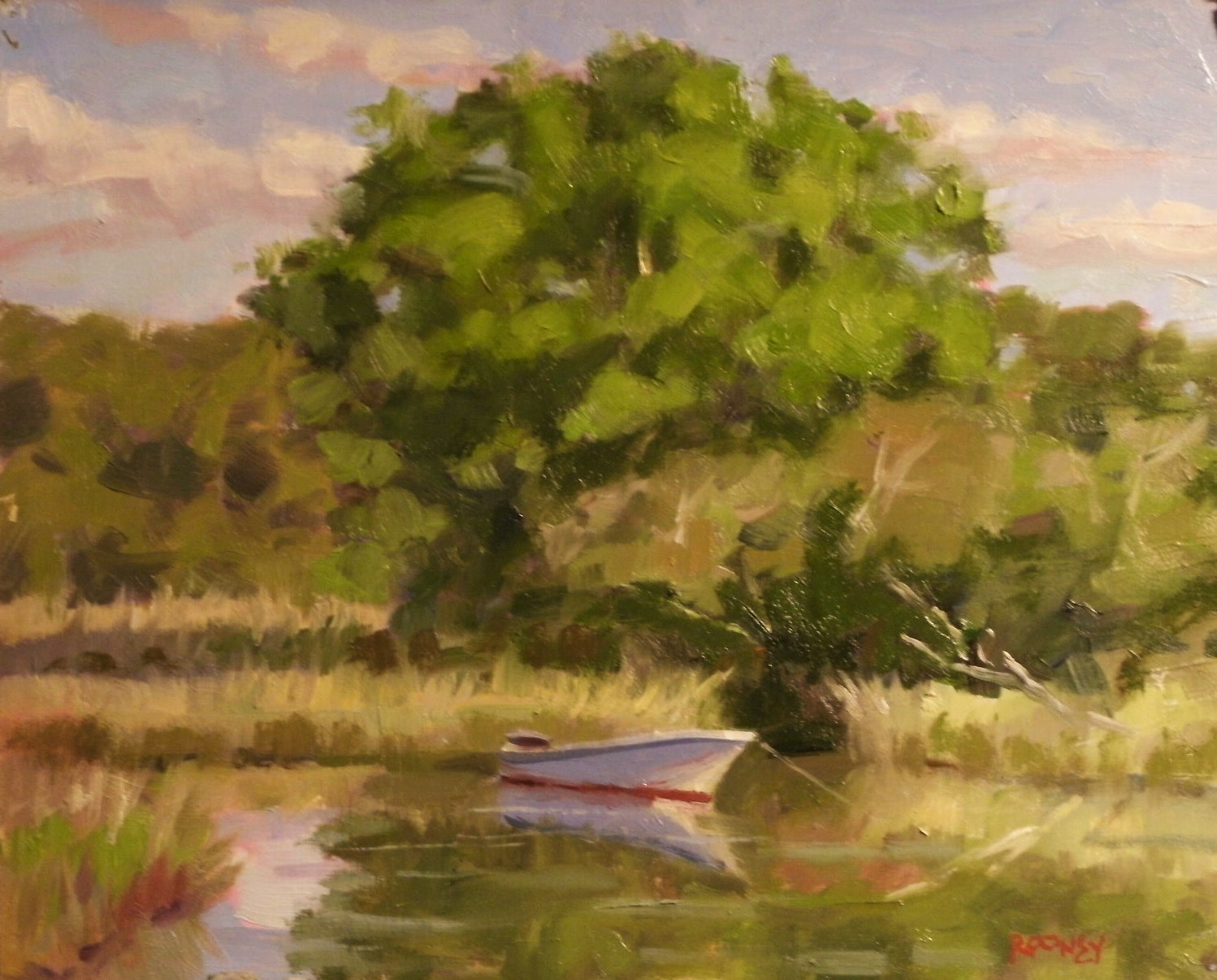
sort of like this one. only this is not a real warm scene. i look at it and see that the warmest shape (and its small) is the green grass in front. its not a big part of the scene so i put down rose madder acrylic real thin(a wash) in the light shapes and darker in the shadow shapes (more out of the tube)

this will allow pink will peek out all over the painting setting the light effect and that flickering effect us cape school inspired painters love.

Ive got some DVD's available for $24.99 each and i'll ship em to you free. if youre interested in one let me know and i'll give you a choice of five different titles from boat painting to architecture.

The Tuscany workshop is a go. it'll be the last week of september and first week of october. ten days of instruction. classes are before lunch with several classes from drawing to painting to photography, and youre free to do your thing the rest of the day. contact me if youre interested. its filling up quite quickly.

Wednesday, April 14, 2010

Pivers Island Anchorage-11x14

Note:

my email box is getting jammed with the Question and Answer thing. Please put all the questions you'd like answered on the COMMENTS section of the blog only. i'll respond to them on the blog only.

that way i can respond to one persons question so many people can see the answer, versus one on one which would be way too time consuming and i'd get burned out on and quit


thanks for understanding....


now my latest painting, Pivers Island Anchorage


If youre interested in this one contact me for price and availability


This is what i walked out of the field with. it was funny. i was so engrossed in painting that when i was checking some shapes i noticed that the boat wasnt lining up with the dock like in my original drawing when i first started. it was driving me crazy how i could have been so off in my drawing and was considering redrawing the dock higher than the boat like i was seeing it. Then it hit me.... stupid! the tide had gone down so much that the boat WAS higher when i first drew it! so i left it alone.

when i was tweaking in the studio i didnt like the water and thought i'd lighten it up and saturate the blue some. i got it just a little to grey out there for my liking. being such a big and important shape i decided to try it out on a plastic sleeve first. after i decided that was much better i mixed a big pile of that color and took the sleeve off and painted it in. worked great. that way you get to look at the change and decide if you like it or not before committing in paint on your original.


here's my reference photo in case i needed it, which i did. thought i could finish it outside, and almost did, but i'm doing more to them in the studio now than i used to. so far to approval from everybody who's seen my work prior to now. so thats a good thing!


notice the biggest thing i did to correct the composition. do you know what it was. sure you do! i removed the pole in front of the boat. i thought i liked it out there but when i saw the painting after "the heat of battle" out there, i decided it would look better with out it. it was cutting the boat in half. i also edited out the boat on the dock out there deciding it would be too distracting. took out the building in the background deciding it was not an attractive shape, would be confusing as to what it was, and the gave me a way to continue the far distant strip of trees into the middle of the painting instead of having trees all the way across. i made up the beach in place of the sea wall that was really there. pulled that from my imagination, something i couldnt do several years ago. cant believe i used to just paint em and sell em without really trying to catch stuff like that. thought they were "more authentic plein air pieces" that way. thats my story and i'm sticking to it LOL


i can be deadheaded sometimes!


answers to some of the questions you've been asking in my next post, promise!

Monday, April 12, 2010

Arendell St.-8x10


Contact me for price and availability if you like this one
Have been wanting to paint this scene for years. i always drive by it and the sun's not in the right spot or there's too much sea fog to see the water tower in the distance, something. well saturday morning it was perfect. so i set up and banged away at it for a couple hours. my new found habit of sketching is paying off with more accurate drawings, and in less time too.
Starting a new feature on the blog. if you have questions about anything in my posts, anything about methods, subject matter, or anything at all you'd like to ask, leave them as a comment and i'll respond to them in future posts.
here's some ive got already-
Q:about toning canvases with colored gesso all at once, or tone them indivually
A: i use about a dozen methods of underpainting from using thin washes of acrylic to wiping on and wiping off alizarin crimson and a little green, to the strictly cape cod technique. i like to wait till i see what i'm going to paint to decide what to pull out of my bag of tricks. if you do them all in advance i'd think you were pretty well stuck. but there's no right or wrong so try it several ways and decide which way you like working the best
Q: about best way to photograph paintings
A: i shoot my pics on my easel with two flood lights covered in tracing paper. one over my left shoulder and one over my right shoulder. the painting low on the easel. glare is when the light hits at a perfect 90 degree angle to the lens of the camera. all you have to do is change that angle and you wont have glare. then take it into a photo editing program and drop the light value just a bit, and up the contrast. fool with the color settings until the pic looks like the painting. i know its tempting but be sure to NOT make the pic look better than the painting. anyone seeing the original after seeing the "doctored" version would be a little upset and disappointed.

Saturday, April 10, 2010

Charleston Traffic Jam-10x8-SOLD

yesterday i left off after the darks where in. then once it soaked in and set up a bit, i mixed up all my lights on the palette so i could relate one to another. you ask questions like whats the lightest, whats the warmest, whats the most saturated, least. i usually mix the one i KNOW i can get right first, and then relate all the rest to that one. if that first one's wrong the others will be as well so i take my time on the first one.


SOLD

Here's the finished product. it has the dreamy look that charleston has when the light is coming over one side of the street like it is here.


i stuck it in the warm, dark frame with just a hint of gold around the fillet, i talked about yesterday, and i was so stoked about how it looked. really classy and expensive looking. cant wait to see this painting on the walls in the gallery hung up with all the others around it.


the best part of a show is the first time you see the 15-30 paintings youve been working on for months, after the gallery "hangs the show". you've been working on for these things a long time. each painting has its own life as a seperate thing, but then there's the dynamic of all these individual entities when theyre all hung up together, side-by-side, as a body of work. its hard to describe the feeling you get when you first see it. all that blood, sweat, and tears hanging up there for all to see. when the people come in and see em, will they love em, will they hate em, will they help me pay the electric company?

you want em to sell, have a nice home, but you hate to part with some of them. you feel like you accomplished what you set out to do on those gems, and you know you'll never see em again. but those are the ones that make living this crazy life as a painter so worth it.

Friday, April 9, 2010

Charleston Work-Step by Step demo-8x10

the thing about doing thumbnails (if you went a long time without doing them) is you begin to like seeing your ideas a couple of different ways. you can work out the value shapes and see if you like it vertical or horizontal.


i draw on the tonal shapes using some burnt sienna-looking color from a tube of Charvin paint Jerrys Artarama gave me to try out. i didnt really like it for finish paint (seemed a little "greasy" to me) but i'm going to use it up on underpaintings. i like its orangey-red color. when i want it darker, i added alizarin crimson. all this has lots of thinner and Liquin added. i should say first that i wiped on rose madder acrylic in a thin wash on the white gessoed panel. that way when i want a much lighter shape, i take thinner on a rag, or QTip (if its small) and i can get right back down to the rosy light tint of acrylic. those shapes will get the light shapes on top of them.


here it is with most of the darks applied. you know you did it right when the rosy acrylic represents all the light in the painting. i'll let this paint "set" while i watch my favorite show "the Sopranos" (the PG version on A&E).
next comes applying the sun shapes. now heres the trick- dont let anything in the light (on the top coat) be darker than any of these values.
more when i finish this. cant wait to stick this in some beautiful dark frames i bought from Graphic Dimensions. they really compliement paintings that have rich darks in them like this will have.

Thursday, April 8, 2010

Harkers Island Shoreline-12x16


If you like this one contact me for price and availability


Headed to the City Art show in may


I see now that playing with these paintings in the studio, after getting 80% of it done outside, is the way to go on these bigger ones. get the big shapes out there. you can always change small compositional problems and make the painting better inside. but the key is dont change the values and colors too much, then look at the reference photo for any areas that are a little vague. having painted outside almost everyday for a long time, i have a mental reference library that i can rely on to fill in the blanks. for example what does green grass do as it goes back in space? it lightens, cools, and desaturates (grays) as it flattens out going into the distance. the reason is the angle is changing that you are looking at the top of the grass from. the cool blue sky overhead and atmosphere (particles hanging in the air between you and the subject) is playing a bigger and bigger part the farther it goes back in space, thus cooling and lightening it. good to know when youre not out there looking at it anymore. or you are out there, and you dont have time to put that down in lieu of getting other more important things down like shadow and light pattern, doing accurate drawing and color notes. a very good reason for painting outside every chance you get. nothing takes the place of direct observation!

Morehead City Waterfront from Capt Bills-9x12

A friend of mine from a gallery on Cap Cod is holding a workshop, so if you'll be up there and want to attend contact Gallery 31 and they'll sign you up
LANDSCAPE PAINTING WEEKEND ON CAPE COD

Location: Gallery 31, 31 Main Street Orleans, Massachusetts

Dates: Saturday, June 26 and Sunday, June 27, 2010

Time: 9 a.m. to 5 p.m.

Cost: $110.00 per participant, limit of fifteen.
This workshop is designed for the beginning and intermediate participant.

This two day landscape painting workshop will take place on locations near and around
Gallery 31 in Orleans. Following a brief meet and greet at Gallery 31, we will begin our day a short distance from the Gallery and assemble at Rock Harbor in Orleans. There will be a demonstration by a gallery artist in “How to Start a Landscape Painting”. We will discuss the importance of the original sketching process, composition, values and color. Several artists and instructors from Gallery 31 will work one on one with you throughout the two days, thus providing the participants with a supportive and collegial atmosphere. Each morning will be followed by an informal group critique. We will then break for lunch where participants can choose from a variety of local eateries within walking distance of the gallery, and one actually in Rock Harbor. We will paint at a different location during the afternoon session and have an end of the day critique at 4 p.m. Day two will find us painting on location at sites to be determined on Saturday. Sunday’s class will conclude with a critique and a wine and cheese reception.

"Morehead Waterfront" photo reference


if you like this one contact me for price and availability
Headed to the City Art Show in May


Sometimes a painting paints itself in spite of everything! this was one of them and i dont know how or why. the wind was howling off the water, and i must have tried to tie down the umbrella i paint under a hundred times. the light doesnt wait for such wastes of time, so i got all the really big shapes down in the right color notes and got fed up with wrestling the umbrella and left after the plein air session. in the studio i only had to do a few tweaks on the sign, stripes on the street, a few sailboat masts, and a car or two. i let your imagination fill in the rest.
what i'm really concentrating on this week is tying all the dark shapes together for a more cohesive light/dark shape pattern. the more you can link the darks together, the more dynamic the painting. when you fragment lights and darks it looks just that...fragmented.
in this one the large dark shadow pattern jumps across a small gap in the mid-ground and joins a mid-to dark shape on the far right in the background. then you have some nice light shapes on the front of the building,brick sidewalk, pavement, and sky.
the nice little accent of color i love is the shadow portion over the door in the shade. i warmed it up with yellow ochre to show the turn in the building and that reflected light bouncing up from the lighted pavement. it might not show up that good on your monitor but it looks neat in person. you cant see stuff like that in photos. another reason to only paint outside!

Wednesday, April 7, 2010

Beaufort Parking Places-SOLD

6x8
Painted in 30 mile an hour winds on Harkers Island most of today. its really tuff on the body and mind when youre hanging onto the easel with one hand and a paint brush in the other. you cant get accurate small strokes with the wind pushing on your hand and the board bouncing around. very tiring
On Beaufort Parking Places i found a sheltered area in Beaufort, and tried to capture the "contre Jour" scene. its a french term for backlit that literally means "against the day". A very poetic and fitting term. over half of what i paint are contre jour scenes. i'm fascinated with capturing the effect of looking into the sun. you also dont have to set up an umbrella (perfect solution to todays gale force winds) because the sun is behind your canvas and i made a sunshield attachment for my pochade box, to keep the sun off my palette. my advice is to always have your painting and palette in the shade. if you mix with them in the sun you will invariably mix the values too dark and you'll hate it when you get it under studio or gallery lighting.

Tuesday, April 6, 2010

The Enhancement-8x8-SOLD

 SOLD


I'm working feverishly for my two man show at City Art Gallery starting May 13th. showing with friend and fellow painter Kristin Gibson, who does fantastic still lifes. really looking forward to this show and i think the landscapes and still lifes will be a great mix.
today i painted in heavy winds near radio island, one of my fave old boatyards. everybody knows me and gives me free rein in the place and they dont gawk. i think jimmy womble (beaufort painter) goes there alot too, so theyre used to the two of us crawling all over the place painting.
in this one, called The Enhancement (headed to the May show), i like the powerful shape of the Elise G against a midday, warm blue sky. as you can see i pushed her a little warm to play up the orange/blue compliment color scheme. i made the it go blacker, but only on the far right side of her bow. keeps it light filled too with all that warmth. i like the blue tarp and probably would have made it blue were it not already. the wind was blowing and it kept changing in the sun and shadow shapes. an exercise in memory painting.
notice how much stuff i left out of my composition. i have no problem editing things if they dont add to the composition. if you can leave it out without hurting the painting, leave it out, EVERY TIME.
Cant wait to see this painting in one of the 8x8 frames i had custom made in key west. the girl was going out of business and had a lot of cool moldings and i made her a deal she couldnt refuse! the black accents on the frame will look very cool with the dark brown/warm black on the hull.
Mark the show reception on your calendar and come say hello!

Sunday, April 4, 2010

Spring on the Marsh-22x28


Contact me if you like this one for price and availability

note:

Ive been getting alot of emails from people worried that now i'm out of Daily Painters Gallery it will affect this blog somehow or that they wont get the posts automatically in their mailbox. have no fear, dropping DPG is seperate and apart from this site, and doesnt affect my blog or "subscribers" to my blog in any way. it just means i wont be on the site dailypainters.com any more. so if you didnt go there alot you wont notice any changes.


Here's the finished 22x28 that i've been working on for the last several days. sketches, studies, two days in the field and some tweaking in the studio. was it worth it? only those looking at it will be able to answer that but i think that i love it. its still has a plein air, spontaneous and colorful look that marks my style, but its more subtle and complex in all the shapes. note: check out the blah marsh picture under this post to see how i colorized it to look like spring.

i had time to work the painting like i wanted to without any thought, whatsoever, of time. it was liberating. work on the painting as long as it takes, period. the question will be will folks think its worth the extra money. but i guess thats why really good wine, sold at a fine wine dealer that took decades to make, costs more than wine called Two Buck Chuck that they just made last month and sell at Trader Joe's grocery store.

Stay tuned for the results!

Saturday, April 3, 2010

Goodbye Daily Painters Gallery!


Well, after much thought i have decided to drop out of my online gallery Daily Painters Gallery. this decision didnt come easily believe me, and as always i drug my feet and should have done it long before deciding to actually go through with it, this week.

it was a very hard decision, as are all decisions dealing with money and your career. i made sales on DPG and it drove alot of traffic to this blog but as i developed as a career painter it became obvious that i was stretching myself thin having over a dozen galleries spread out from cape cod to key west. anyone burning the candle at both ends knows that if you do too many things you wont do any of them to the best of your ability. better to do half as many things really well. i know my gallery owners will be really happy about this decision. Taking more time on each painting i do for them can only result in more and better paintings.


Daily painting and posting online has been a blessing and a curse. while it gave me plenty of sales they were usually priced very very low and kept me too busy to take my time doing gallery work. you were supposed to paint a small one everyday (at least every other day) and sell it really cheap. while i think its a great venue for those without gallery representation its brutal if you do.

so i am taking a leap of faith, slowing down, painting only for galleries and leaving Daily Painters Gallery. i will continue posting affordable, smaller works on the blog and believe that the best are yet to come.
and i'd like to thank all the people that found me on DPG and bought a painting. keep coming back to this blog for even more stuff i think you'll enjoy. just contact me if you ever see one youre interested in.

Friday, April 2, 2010

4th St. Shadows-10x8

if you like this one contact me for price and availability


Day two of the 22x28 marsh piece. yesterday i did an 8x10 to get the image/value and color scheme firmly inplanted in my mind. looking at it i liked the composition and feel of it so i returned at the same time of day and the exact location. i found the holes in the sand the easel made yesterday and set up on them. funny how being just a few feet this way or that will change the shapes.

above shows the acrylic paint i smear all over the gessoed panel using a wet paper towel i wet in the sound water. keeping it lighter in the sky area and a little darker and cooler (compared to yellow)in the land mass area. this dries really quick and i can draw the shapes on with Liquin and alizarin crimson and a little blue. i look at the scene to see if i want to change anything from the 8x10 that i have on the ground (from yesterday) so i can see it easily.


here's what it looks like with some oil on the shapes. lots of Liquin, a little thinner and very loose brushstrokes with my fave 1" American Painter brush from Michael's. this is one of the best large brushes i've ever used. i use only their filberts, the flats, i hate. just my preference but if you ever want a good large brush try it out. the Liquin and paint soak in and dry really quick. up to now i might have half an hour or 45 minutes in it so far.


here i start making the shapes more realistic color-wise, at this point making sure the values and temperatures are being honed in on. whenever you first lay down a color you may think the value and color are dead on. it may well be, on the palette. when you put it up on the canvas it has to look that color with the colors already there, around it. it may not look the same. so then you fix the colors around it to make it look like the color you want. its been said painting is just a series of successful corrections. very well said.


the lights changing after several hours, and at this point i'm a little past the block-in stage. i'll come back tomorrow to finish it. the paint will be pretty much dry to the touch so i'll go back into each shape and make small value and temperature shifts in each shape without messing up the values/temperatures of the big shapes. think of it this way. you worked hard all the way up to this point, why would you want to change that. all we want to do is add complexity, and firm up details, and do the final check that all values/temperatures/shapes are correct. that will come in tomorrows painting session here. same time. same place, same Bat station.


Thursday, April 1, 2010

Coming Alive-8x10

If you like this one contact me for price and availability


Another step-by-step of a larger work ive got in my head. here's a digital pic of the scene
note: see why i dont like to paint from photos? i know you can photoshop it and saturate the colors up but those arent the real color harmonies now are they? much better to stand there and mix what you see. this way it smacks of reality, and why wouldnt it?

then....

i begin with a few thumbnails after climbing down into the marsh. i had two ideas but after drawing them i liked the top left scene better than the reflections of some trees i liked too. i moved the land mass over in the middleground, edited out the rocks in the foreground to make the rocks in the middle ground the most detailed (focal point) and more prominent, and zoomed in on the scene.


i lay down a yellow ochre/orange acrylic underpainting and then mix up colors close to the shapes with oil paint and Liquin. Here i'm more interested in getting the value right and i'm trying to hone in on the temperature and hue, but thats secondary.


after i finished the plein air pc, i realized that there was one trouble spot on the piece coming out of the field (before fixing it later this afternoon). so i went to eat lunch and think about how to resolve it. decided to go back and take some reference photos of that one area giving me a problem. took my sketchbook back and wrote some notes on it that you can see on the sketchpad to remind me in the studio what might help fix it. between that and the photos i was able to resolve the problem.

my new mantra "its not how many you can do in a day, but how many good ones can you do, period" is making me alot less production oriented and more quality oriented. that means slowing down, doing sketches, thinking, fixing etc. when all youre concerned about is numbers its absurd to even consider such steps. no time! this new MO will take a year or so to get firmly ingrained in me but better paintings will be worth it. hopefully my conversion rate (paintings done: to paintings sold) will increase and reward me. Being thoughtful and trying to do paintings that dont have glaring problems is hard work. much easier to bang em out and not think about the end product too much. just being honest


i'll use the finished 8x10 as a dry run for the big one, which should slide off the brush with all this prelim preparation. thats the plan, anyway.